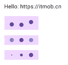
本文将介绍怎样通过 Jetpack Compose 实现表示正在加载的无进度条圆点动画,如下图的效果:
可以实现不同的动画,如:弹跳,渐变,缩放等。实现起来只需要一个 Row,然后把圆点(自定义的 DotIndicator)放在里面,并使用 animate 为每一个 DotIndicator 设置动画效果,animate 接受一个初始值、一个目标值、一个动画规范,以及一个 lambda 表达式在动画值更新时调用并更新每个远点的动画状态。
如下是实现代码:
// ----------- START - DotProgressIndicator.kt  更多详见:<https://itmob.cn> -----------
package cn.itmob.animation.progress

@Composable
fun DotProgressIndicator(
    modifier: Modifier = Modifier,
    color: Color = MaterialTheme.colorScheme.primary,
    dotRadius: Dp = 12.dp,
    indicatorCount: Int = 3,
    indicatorSpacing: Dp = 16.dp,
    animationType: AnimationType = AnimationType.Bounce,
) {
    val state = rememberProgressState(animationType, indicatorCount, dotRadius.value)

    Row (
        modifier = modifier,
        horizontalArrangement = Arrangement.Center,
        verticalAlignment = Alignment.CenterVertically,
    ) {
        IndicatorSpacer(Modifier, indicatorSpacing, dotRadius, animationType)
        repeat(indicatorCount) { index ->
            DotIndicator(
                modifier = Modifier.then(
                    when(animationType) {
                        AnimationType.Bounce -> Modifier.offset(y = state[index].dp.coerceAtMost(dotRadius))
                        AnimationType.Fade -> Modifier.graphicsLayer { alpha = state[index] }
                        AnimationType.Scale -> Modifier.scale(scale = state[index])
                    }
                ),
                color = color,
                dotRadius = dotRadius,
            )
            IndicatorSpacer(Modifier, indicatorSpacing, dotRadius, animationType)
        }
    }
}

enum class AnimationType {
    Bounce,
    Fade,
    Scale,
    ;

    internal val animationSpec: DurationBasedAnimationSpec<Float>
        get() = when (this) {
            Bounce,
            Scale,
            Fade -> tween(durationMillis = animationDuration)
        }

    private val animationDuration: Int
        get() = when (this) {
            Bounce -> 300
            Fade -> 800
            Scale -> 400
        }

    internal fun animationDelay(indicatorCount: Int): Int {
        return animationDuration / indicatorCount
    }

    internal fun initialValue(dotRadius: Float): Float {
        return when (this) {
            Bounce -> dotRadius / 2f
            Fade -> 1f
            Scale -> 1f
        }
    }

    internal fun targetValue(dotRadius: Float): Float {
        return when (this) {
            Bounce -> -dotRadius / 2f
            Fade -> .2f
            Scale -> .2f
        }
    }
}

@Composable
fun DotIndicator(
    modifier: Modifier = Modifier,
    color: Color,
    dotRadius: Dp,
) {
    Spacer(
        modifier = modifier
            .size(dotRadius)
            .clip(CircleShape)
            .background(color),
    )
}

@Composable
fun IndicatorSpacer(
    modifier: Modifier = Modifier,
    indicatorSpacing: Dp,
    dotRadius: Dp,
    animationType: AnimationType,
) {
    val indicatorHeight = when(animationType) {
        AnimationType.Bounce -> dotRadius*2
        AnimationType.Fade -> dotRadius
        AnimationType.Scale -> dotRadius
    }

    Spacer(
        modifier = modifier
            .size(indicatorSpacing, indicatorHeight)
    )
}

@Composable
fun rememberProgressState(
    animationType: AnimationType,
    indicatorCount: Int,
    dotRadius: Float,
): IndicatorState {
    val state = remember { IndicatorStateImpl(indicatorCount, dotRadius) }

    LaunchedEffect(Unit) {
        state.start(animationType, this)
    }

    return state
}

@Stable
interface IndicatorState {
    operator fun get(index: Int): Float

    fun start(animationType: AnimationType, scope: CoroutineScope)
}

class IndicatorStateImpl(
    private val indicatorCount: Int,
    private val dotRadius: Float,
) : IndicatorState {
    private val indicatorValues = List(indicatorCount) { mutableFloatStateOf(0f) }

    override fun get(index: Int): Float = indicatorValues[index].floatValue

    override fun start(animationType: AnimationType, scope: CoroutineScope) {
        repeat(indicatorCount) { index ->
            scope.launch {
                animate(
                    initialValue = animationType.initialValue(dotRadius),
                    targetValue = animationType.targetValue(dotRadius),
                    animationSpec = infiniteRepeatable(
                        animation = animationType.animationSpec,
                        repeatMode = RepeatMode.Reverse,
                        initialStartOffset = StartOffset(animationType.animationDelay(indicatorCount) * index)
                    ),
                ) { value, _ -> indicatorValues[index].floatValue = value }
            }
        }
    }
}

// ----------- END - DotProgressIndicator.kt  更多详见:<https://itmob.cn> -----------
DotProgressIndicator 实现的三种动画效果的用法和效果:
DotProgressIndicator()

DotProgressIndicator(animationType = AnimationType.Fade)

DotProgressIndicator(animationType = AnimationType.Scale)
总结:
实现代码比较简单没有过多解释,DotProgressIndicator 的还实现了通过参数对其颜色,圆点大小,圆形指示器数量,圆形指示器的间隔大小的调整。